An innovative biotech company from Hamburg, producing sustainable protein by growing bacteria at unparalleled speed.

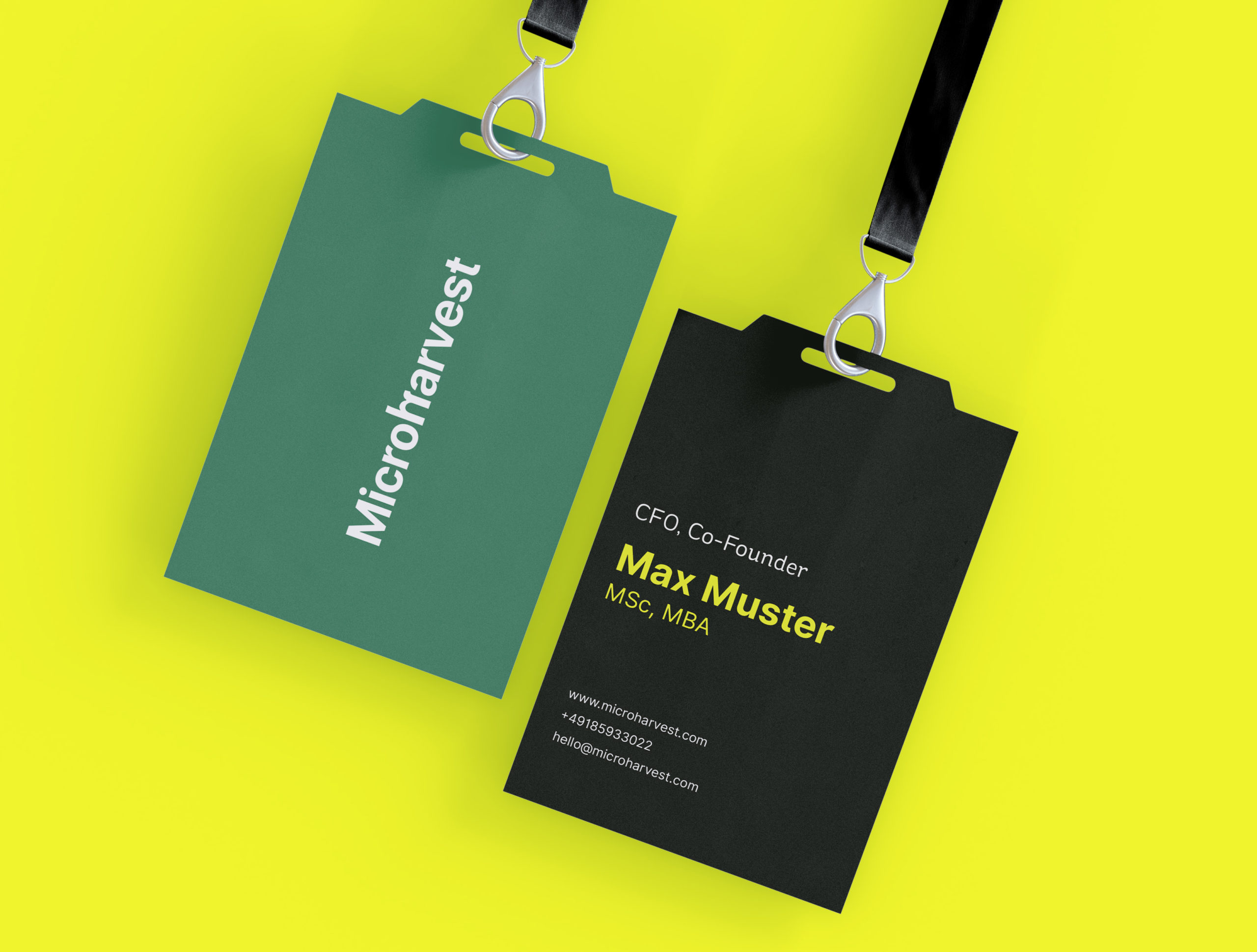
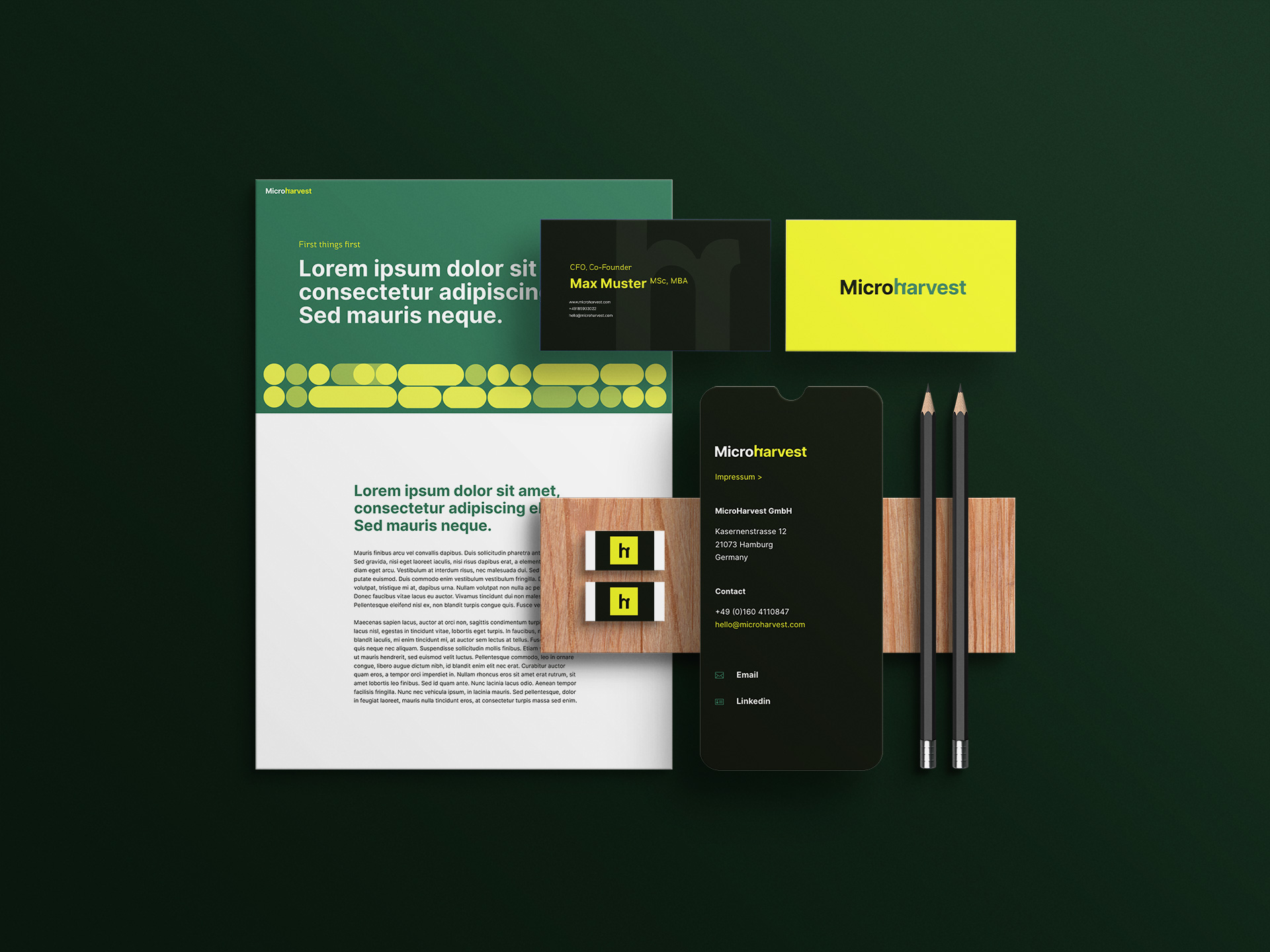
I went for a bold color scheme which steers away from the traditional primary reds and blues seen in the food + feed industry.
The emphasis is on the letter “h”, hinting at growth. Inverted, it is the mathematical symbol for “micro”. The geometric repeat pattern was inspired by the way bacteria splits and grows.
At a Iater stage I moved onto designing and implementing the MH website using the same logic. The homepage animation mimics an abstracted bacteria growing.
MicroHarvest are working on an innovative and exciting new way of making protein on a big scale, solving a lot of problems in sustainability, food and feed.
I covered their early-stage needs by creating the brand guide and website design/implementation. Their Series A round brought in 8.5M€ of investment. Just like their product, they started small and are growing exponentially fast.


